The six transistor SRAM cell is one of the most prevalent circuits in microelectronic design. Yet, when I talk to an engineer or a student about SRAM noise margins, the discussion is usually mired in misunderstanding and confusion about what actually constitutes cell stability. Why is this? Because the four transistor circuit that makes up the core of an SRAM cell is a rather complex, two dimensional closed loop feedback system (if you think I’m overcomplicating the situation, read on.) Most digital designers rarely deal with closed loop systems at the circuit level – and while most analog designers deal with closed loop systems exclusively, they are typically focused on transfer functions, pole/zero analysis, phase margin, and the like. To make things worse, SRAM cell stability (and noise margins in general) are usually taught early on in the engineering curriculum using the “Butterfly Curve”. While this curve is the correct way to quantify the dynamics of a six transistor (6T) SRAM cell, I would wager that most people don’t really know why. To illustrate that point, let me pose a few questions:
- Each line of the butterfly curve is the DC transfer function of one inverter in the SRAM cell. Why does it make sense to draw the DC transfer function of an isolated two transistor circuit on top of a plot that represents a closed loop six transistor circuit?
- Why is SNM measured by fitting the largest box possible inside of the butterfly curve lobes? Why not a line, or a circle?
- When a cell is written to, do the cell node voltages follow the paths shown by the butterfly curve?

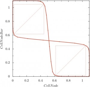
To answer these questions and extend our understanding of the butterfly curve to ALL bistable circuits, let me start from the beginning. On the right you see a standard 6T butterfly curve during standby (both wordline devices are off). This plot is actually a two-dimensional state space of a bistable circuit – each point represents a possible combination for the voltages on the bistable nodes, in this case the data nodes of an SRAM cell. The top left of the space is a stable solution for the system, where (CellNode, CellNodeBar) can be logically written as (0,1). The bottom right is the second stable solution, (1,0). In the middle, we have a metastable solution where both cell nodes are at (0.5, 0.5) and with any amount of disturbance will quickly swing to one of the stable points. So what are all of the other points we have drawn here using the butterfly curve? What is so special about (0.8, 0.5)? Why not plot (0.9, 0.3)?
To understand where the butterfly curve points come from, let’s look at another representation of the cell state space.

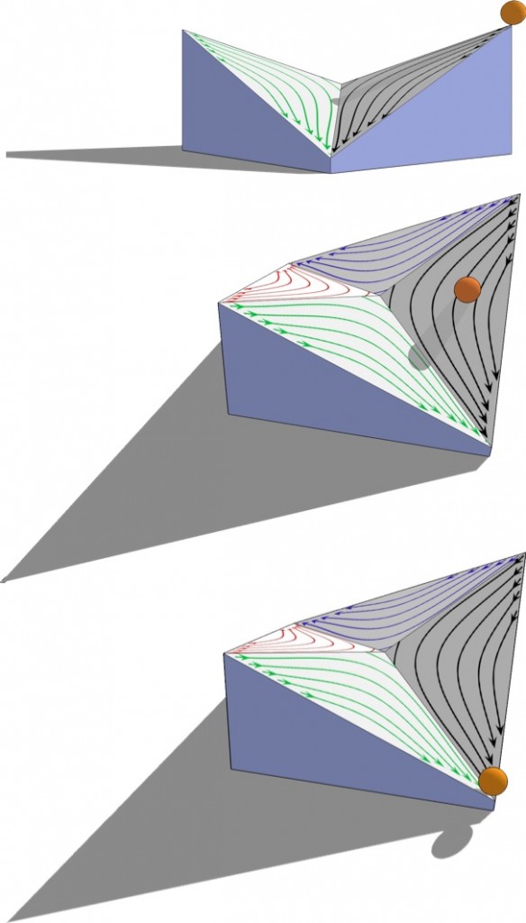
In the leftmost figure, we see the state space looking straight down from the top, which is exactly how the butterfly curve is plotted. The two stable positions can be seen, and I’ve drawn contours to show how the cell nodes “move” from any point in the state space to one of the stable nodes. The two figures on the right show what happens if we tilt the state space and view it in 3d. We see that the contours “funnel” then cell nodes toward the stable positions. The metastable point is represented by the saddle in the middle where the cell is equally likely to go toward each of the stable points.

If we represent the position of the SRAM cell nodes using an imaginary ball, we can see how the voltage at each node progresses through the state space. Imagine that we start with the cell nodes at (1,1) as shown on the left. We could do this with an initial condition, and then run a transient simulation. What would happen? The ball would head toward metastability and just sit there, assuming everything is ideal. In reality, the ball will get pushed toward one of the stable nodes and progress along some trajectory that ends at a stable point.
We can see here that the ball has been pushed away from metastability and is progressing toward the (1,0) stable point.
In the last figure, it settles in a stable position. Now we can visualize what “stability” really represents, mainly how difficult is it to get the ball over to the other stable node? For writing to an SRAM cell, we want this to be as easy as possible. However, when reading from the cell, we temporarily disturb the cell nodes, and we don’t want to accidentally push the ball to the other side. Thus we need to carefully design the contours of this 3d space to provide a nice balance between writability and read robustness.
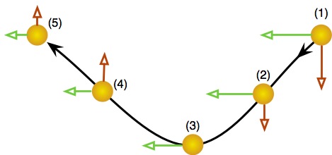
So how does the butterfly curve fit into this picture? Let’s take a look at the trajectory that the ball followed and why it followed that particular path.

In this figure, we have shown the ball traversing from the (1,1) starting position to the stable (0,1) point. In position (1), both of the inverters within the SRAM cell are “pushing the ball” (injecting current into the cell node capacitance) almost equally. As we move from position (2) to position (3), it becomes clear that the inverter represented by the green arrow is dominating while the red inverter is diminishing. In fact, at position (3), the red inverter current is zero and we have an inflection point in our trajectory. As such, in positions (4) and (5), the red inverter current has reversed and both inverters in the SRAM cell are working cooperatively to move toward stability. It is the location of position (3) – the inflection point of the trajectory – that determines the shape of the butterfly curve. To bring everything together, let’s look at one more set of state space curves.

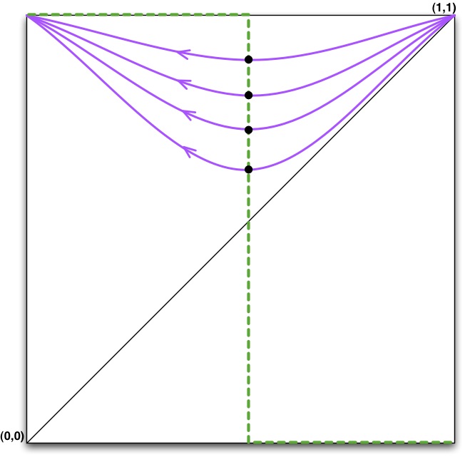
In this state space, I have plotted a few similar trajectories starting at (1,1) and progressing to (0,1). On each trajectory, I’ve placed a dot at the point of inflection (position (3) from above.) If we draw a line through all the points of inflection, we will get the green dashed line that bisects the state space in half. Let’s repeat this process for the set of trajectories starting at (0,0,) and ending at (0,1).
Again, we mark all the points of inflection and we get a second green line that bisects the state space yet again. These dashed lines are the butterfly curves of an ideal 6T SRAM cell! We have effectively divided the state space into four quadrants. In the top-left and bottom-right quadrants, both inverters of the SRAM cell are pushing the cell toward stability. In the top-right and bottom-left quadrants, the inverters are “fighting” and the cell is mostly heading toward metastability.
Let me wrap up this post with a few statements:
- The butterfly curve is actually a set of state space points at which the “motion” of the cell has changed direction, heading toward stability instead of metastability.
- In mathematical terms, these points are referred to as “nullclines”. They are points in the state space where one of the system’s vector components is zero. This represents a point of inflection.
- The “ideal” 6T butterfly curve is truly a square box. This is why we measure noise margin by fitting a box into the butterfly lobes. The larger it is, the closer we are to the idealized system. The largest it could possibly be is 1/2 of the state space boundary, or Vdd/2.
In this post, we explained what the butterfly curve represents. We’ve also answered question #2 at the start of the post (why use a box to measure noise margins?) In the next post, we’ll cover methods for generating the butterfly curve as well as answer questions #1 and #3.
